Using Color in the Landscape
 Color is the most rewarding, yet challenging, element to work with in the landscape. As in cooking, too much spice can render a meal inedible, a very common mistake is to substitute color for a good garden design. The addition of spice should not make the meal, yet instead enhance the subtle qualities of its flavors.
Color is among the last considerations in the landscape design process. Solving functional needs, activity areas, use spaces, and circulation patterns should be achieved first, with color being the patina in which the rest are painted.
This is not to imply that color is unimportant, for in terms of the human senses it is paramount. Vision is the first sense that we utilize to gather an impression, from which all other senses follow.
Color can be utilized in the garden for the following effects:
- To bring life and excitement to the landscape
- Accent important areas that you want noticed (for example the front door)
- Blend the exterior environment with structural colors to tie the overall design
- Complement the colors of other plants
- Attract animals and insects, such as birds and butterflies
- Create a mood
- Balance bed and landscape designs
- Provide variety and interest through the seasons
Color Characteristics
Color has a basic, instinctive visual appeal. As famous color authority Faber Birren once said, "Color is the one experience in life that requires no conscious struggle of the intellect to appreciate."
Color theory is extremely complex, but the essential fact is that color is a property of light. This was proven by Sir Isaac Newton in the 17th century when he put white light through a prism. The prism broke up white light into the familiar rainbow of hues.
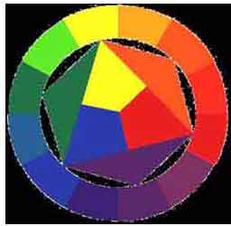
Hue refers to the name of the color. Red, orange, purple and green are hues. These are most commonly arranged in what is known as a color wheel. The color wheel uses twelve hues, which are divided into three categories.
The primary colors are red, yellow, and blue. From these, all other colors are mixed. The three secondary colors are orange (red and yellow), green (yellow and blue), and purple (blue and red).
 In the garden, this color theory was perhaps best known in the work of Gertrude Jekyll. This 19th century garden designer developed color theories in her perennial garden designs which are still influencing gardens today. The artist Monet composed his garden with the eye of a painter. If you look closely at one brushstroke of his paintings you will see several colors combined which provide the overall color scheme. Individual flowers in a perennial bed also combine to provide an overall color scheme.
Properties of Color
Colors mean many things to many people, but one thing that is certain is that it can impact our emotions and psychology. For example, red is symbolized in many colors with danger (as found on our stop signs and lights). Yellow can mean caution or sacredness. Both of these colors are known as 'warm' colors and are among the strongest hues in the landscape. Conversely, blue and green are cool colors and can cause more passive, relaxed feelings. As you look at them, warm colors tend to advance toward your eye in the landscape. They are among the first items that you notice. This is why warm colors are difficult to design with in a garden because they are so strong, and must be incorporated wisely due to their overpowering nature. Be careful of putting warm colors near areas that you don't want people to focus, such as service or functional areas. Instead, place them at the points that you want people to look, such as entrances and focal points. Cool colors are just as important as warm colors. In fact, warm colors are not as effective as when balanced nearby or behind with blues and greens. Since cool colors recede they offer a valuable service of making a small landscape look larger.
Color Design
How does one begin to choose colors for a garden? Context plays an important role here in the success of a garden design. Environmental influences, color schemes that are predominant in the neighborhood, and the color of your house or other site features all play a strong role in color choice. Colors in arid, southwestern landscapes vary considerably from the cool, green landscapes of Mississippi, or the distinctly regional colors of New Orleans architecture. Be conscious of all hardscape material colors, such as paving, site furniture, fences, garages and other items. Color is also an individual choice that reflects the gardener's personality and wishes.
Color Schemes
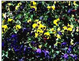
Colors can have a harmonious effect in certain combinations. Monochromatic colors involve the tints and shades of one pure color. A tint is lighter than the pure color, a shade is darker. Many impressive gardens have been planted in a monochromatic color scheme. An example would be red, various pinks, deep red, or maroon. Analagous colors use hues that are next to each other on the color wheel. Fore example, red-violet is next to violet, or blue is next to blue-green. With the wealth of annual and perennial plant cultivars available, these combinations are not difficult to achieve. Complementary colors are directly opposite from each other on the color wheel. These are powerful combinations and very vibrant in the garden. Examples are red against green, orange and blue, and yellow and violet. Polychromatic color schemes combine every color in the rainbow next to each other. This can be random in appearance, but also playful.
Color Design Principles
There are several time-honored color design principles in which to plan the color pattern of your garden. These include unity, focal points, balance, and rhythm:
Unity gives coherence to a design. Unity implies that an agreement exists among the elements in a design and belong together. Unity can be achieved by choosing plants with similar characteristics as a foundation for your plan. For example, azaleas have a medium-sized oval or rounded leaf and rounded plant form. By choosing plants as a background planting that have this characteristic, such as Indian hawthorne or dwarf Burford holly, unity is achieved by using similar-looking plants.Focal points are the opposite of unity, these are points of emphasis that is different than the rest of the plants. Focal points can be architectural, such as a sculpture or fountain, or a plant with an unusual color or form, such as a red Japanese maple or weeping willow. Caution should be used with too many focal points that can detract from each other.Balance is an equal distribution of visual weight. In formal design, we replicate on one side of a feature with what is exactly on the other side to achieve balance. A garden design can also be asymmetrically balanced by balancing visual weight using different plant or color elements. With color, especially warm colors, it is important to repeat the color on the other side of the vision field to rest the eye.
Rhythm is a movement across recurrent motifs. This movement of the eye can be achieved in the garden by the repetition of a certain color at regular intervals. An example would be a line of daylilies placed at regular intervals in a perennial border, one daylily would be a focal point.
Plant Colors
In addition to flower color, plants may have colorful bark patterns, fruit, leaves or fall color. Examples of trees with colorful or textured bark include 'Natchez' crape myrtle, river birch, American beech, and black cherry. Hollies are wonderful winter accents with bright red, yellow, orange or black fruits. There are many cultivars of trees, shrubs, and herbaceous perennials with richly colored or variegated leaves, both during growing season or fall colors.
These factsheets were written by Robert F. Brzuszek, Assistant Extension Professor, The Department of Landscape Architecture, Mississippi State University.
Publications
News
Landscape design and natural landscape enthusiasts will gather at Mississippi State University to perfect their craft and learn from other experts, an annual event happening this year on Oct. 18. The 68th Edward C. Martin Landscape Symposium will be held from 8:30 a.m. to noon at the Bost Auditorium at MSU.
May is here and you know what that means, it’s go time!


